Bella's Pizza
Bella's Pizza
A classic look, reimagined.
A classic look, reimagined.
Food & Drink
Brand Design
Brand Design
The Background
Bella's Pizza is a local favorite in Long Branch, New Jersey. Acting as the premier pizzeria for shore towns like Monmouth Beach, Oceanport, Little Silver, Long Branch, and West Long Branch, they consistently deliver classic Italian cuisine and crispy New York-style pizza while maintaining a strong link to their Sicilian roots.
The Challenge
To modernize following years of continued success, they needed a comprehensive brand refresh that fleshed out their identity without losing the recognition of their original mark.
The Solution
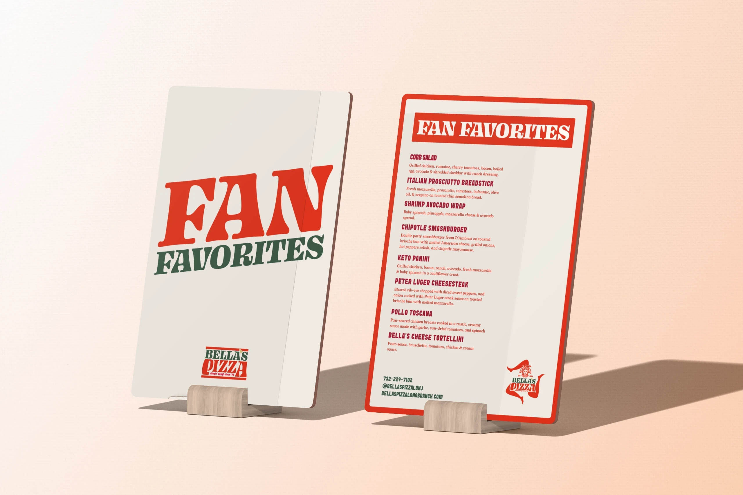
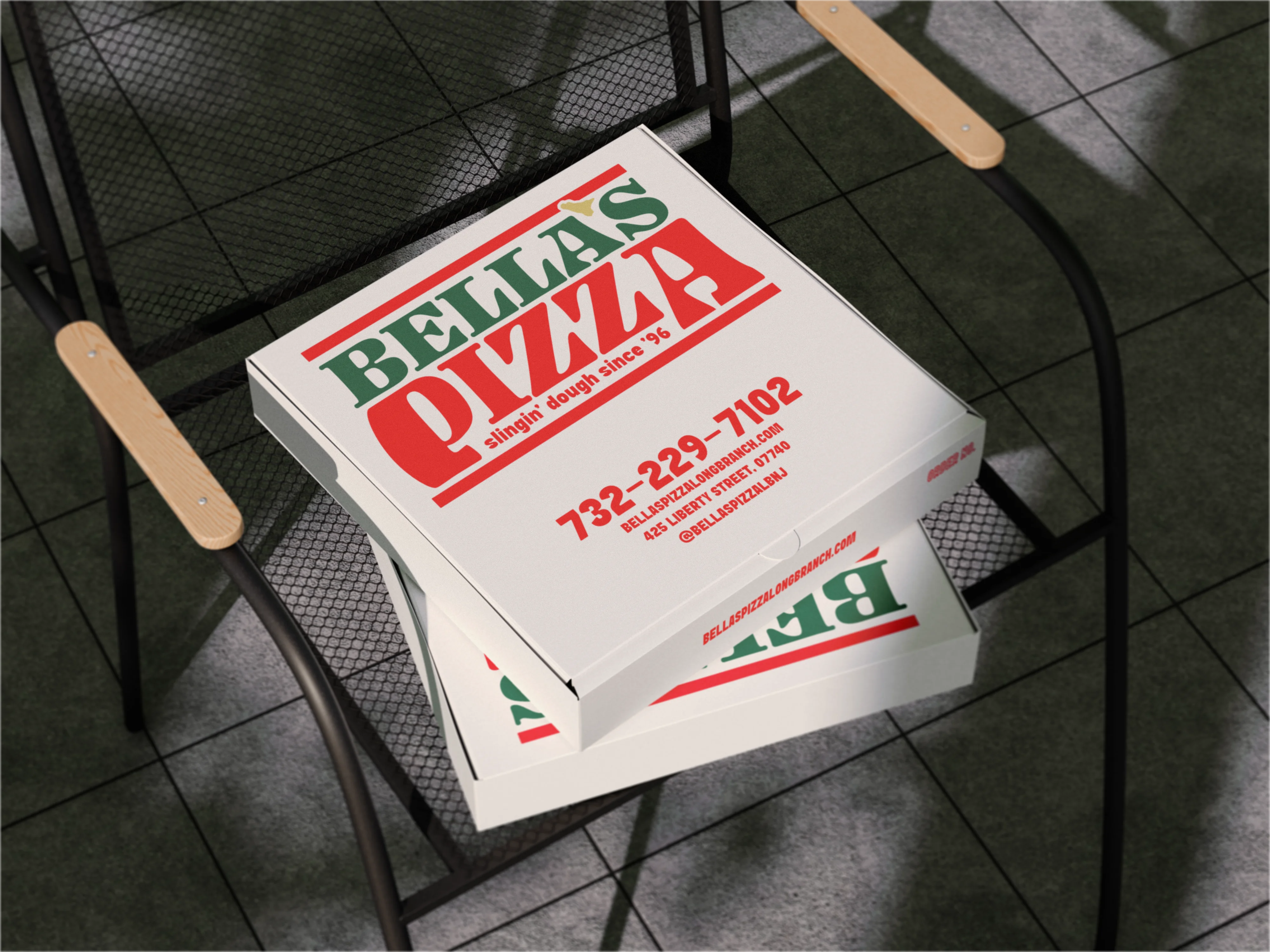
In collaboration with Bella's Pizza, we delivered three logo lockups to ensure excellent brand visibility and control across various restaurant touchpoints. Using the iconic Sicilian Trinacria as a base, we traced the original hand-drawn design while making marked improvements to line consistency and spacing. The type selection provides a classic, bold, retro feel without appearing forced.
The updated identity slots directly into the collective memory of their loyal, long-time customers and serves as an iconic standout to invite new customers into their history.